2.1.1
Color system
Renato Ćorluka
March 19, 2024
One of the most complicated things to get right in development is getting colors right. While there is some math that can help with certain parts of the color system, there isn’t mathematical formula to make colors looking good. Color field alone is science for itself … LA LA LA write more when you catch inspiration.
Color theory
Colors is human perception of different wave length, and colors also have some relation like everything in the nature with frequency (check also our article about typography which covers use of frequency in typography). There are two different ways we could manifest color perception. First is more natural way of colors because that is what we see from moment we are born. That is perception of absorbed light and second way, which is more important related to web design emitted color perception.
Color absorption model (sun)
We have sun during the day which is our source of light, light comes from above us and hits object on earth, as it hits different objects will absorb more or less of that light. This absorption creates different wave lengths which we perceive as colors. We all know that dark colors absorb more of the light so during hot days we wear cloths closer to the white so we could reflect as much as we can of that light.
Color emitted model (displays)
Another color perception model is related to the display, this article will focus much more on this model because we this is what matters the most in web design. We don’t need sun to see colors on our displays because displays are acting as source of the light, or to put that in context of the model they are emitting the light.
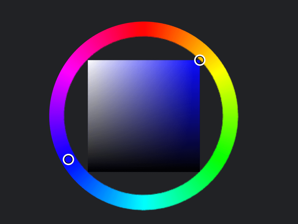
Color wheel
Color wheel is continuous color space representation which indicates hue of colors. While we often see stepped representation of this, it is like gradient continuous representation as we can see in the image below.
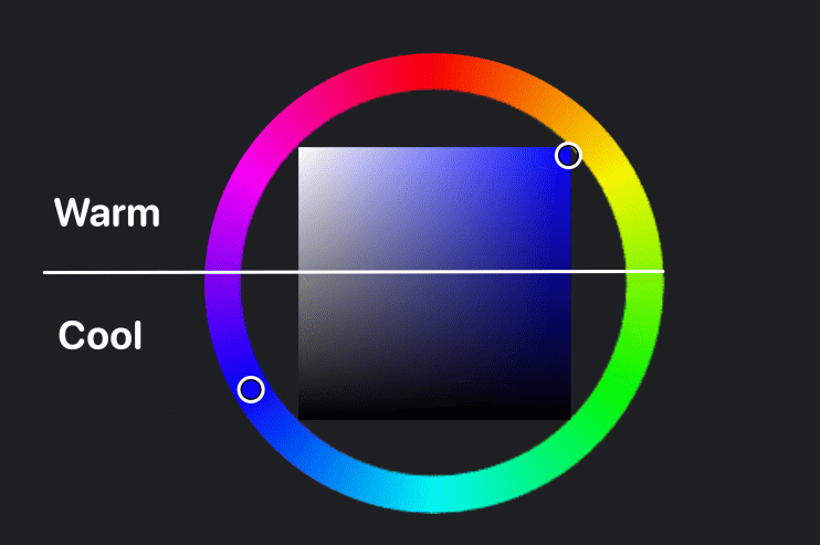
Color temperature
We often hear term of the color temperature like describing colors with warm or cold. These are opposite colors on the color wheel. Warm colors consists of red, yellow, and orange. These colors are associated with energy, passion, and brightness. Opposite of that are cold colors like blue, purple, and green.
Color saturation and chroma
Without going too much into details, these terms are defining how pure or better to say strong is our color. More saturated or colors with more chrome are more pure colors in short without going full scientific. If you wanna learn about difference and far more in-depth about this check this article.
Color systems in design systems
I was researching a lot color part of design systems. If you have time, dig into some of these systems as there is really lot to learn from them, you don’t need take more than 5% from any, but it will really elevate anyone color understanding. These my favorite parts in some of them:
Dark theme
For researching one of the beast sources to read I have found is Google Material Design to be really nice read about this topic. They have pretty comprehensive how-to, what you need to tackle in dark mode and why dark mode can look bad if you don’t take care of these adjustments. You can find out here more about
Tackling color predictability
The most interesting design system in context of colors and approach to accessibility was USWDS. They are using set of luminance scale to create color steps (shades and tints). That way they are sure that switching from any hue to another contrast will stay the same. I have tried to automate this using JavaScript chroma.js while this would give good results for most of the part, some colors were giving bad results and should include manual hue-shift to make them more pleasant. Probably that is reason why colors in their systems are manually tuned to look nicer, but it was interesting read to see how colors should
Automating accessibility checks
The biggest inspiration here was GitHub Primer design system. As they are using contrast check at time of building code, and they get feedback based on rules how each color plays with each other in terms of contrast. This is one of the ways to go, and really impressive solution to tackle inclusive design in system that needs to be really complex. You can find out here more about inclusive design in GitHub Primer.
Understanding contrast, addressing shortcomings
Right now we are using mathematical model based on luminance and some math calculation. This model has certain flaws, or maybe better to call them limitation. When we are perceiving colors that goes far beyond pure simple math. So before we dive into this we are going to dive inside magic.
Color illusion
Please look these two circles below, could you tell which one is darker? I know title will give you half of the answer and that we are pulling some illusion.

Correct answer none. They are exactly the same color, but our eyes don’t focus just on circle, it takes background also in account. Right circle look certainly darker because. This is popular example from color theory.
Current standard
Current standard is not aware of human perception of the color. For humans it does actually matter which color is on which, and we invert colors perception of them won’t be exactly the same. But under the current standard it does not take into account which is color, and which is background, results will be exactly the same if we swap them.
WCAG 2.x contrast, SC 1.4.3, and the related understandings and guidelines, were born in an era before smart phones and iPads, when displays were mostly old-school CRT type and websites used core web fonts. But that was a decade and a half ago. Today the contrast guidelines are in need of a complete overhaul due to the massive changes in computer display technology, web content, CSS functionality, and advances in vision science since 2005/2008, when WCAG 2.x was first introduced.
There are a number of reasons that WCAG 2.x contrast is faulty, one of which is the binary pass/fail nature of the SC for a property that does not apply in a binary way across perception nor impairments. Humans are not binary computers, and it is important to understand the non-linear aspects of perception, and to set guidelines that correctly model perception as opposed to “brute forcing” arbitrary values that ultimately do more harm than good.
– Myndex Perception Research
Future standard
Future standard known as Advanced Perceptual Color Algorithm (APCA) or also referred as WCAG 3 which is currently a draft, should address contrast calculation in much better way related to human perception and if you want to find out more you should definitively check Myndex Research work on this matter.
Color palette generators – good, bad, ugly
If I would need use this phrase only once in my life, I would place bet on color palette generators as perfect match for describing. While these tools are cool, there are problems with them they make good, bad, and ugly palettes. Math does not know play well with knowing if something is ugly, we could reinvent wheel and maybe plug some machine learning, give 100 people to judge colors and make some tool that does not know what is pretty or ugly, but someone told it and get decent results, but it is not really needed as there are huge collections of color systems.
HSLuv, CIELAB, LCH – good
These color spaces perceptually uniform and are in the most cases much better framework to work with colors. While this sounds perfect there is dark side as with almost every mathematical generator you will run into some not ideal cases. In some hues you will get let’s say not that nice looking colors and these will need manual tuning, or some tools overly complex.
Some worth-able tools here:
HSL color generators – bad
These are entry level of every generator which you will want make first. This is probably easiest one to make, if you are learning JavaScript you can make one as student project if you are bored of making todo apps. But if you want more serious color generation, hook up chroma.js that is next step for sure.
Why HSL is bad color space for generating colors? When we are generating colors in HSL color space one of the problems to overcome is huge difference in contrast if we change hue. Check this article to find out more about this subject: Accessible Palette: stop using HSL for color systems
Case – ugly
Mathematical color generation does not work good because color would require lot of manual tuning, and some tools which are giving enough options to tune are not intuitive to use as they have tons of controls to tune every single aspect. Sure they will be fit for some user, but often people want more plug-and-play solution.
Case – awesome (chroma.js)
While this is not color generator, most of complex ones are using this color manipulation library. If you are doing some color generation tool, I would look into this one for sure. You can work in various color spaces, easily transform into another one, kudos to chroma.js it is awesome project. If you have colors and JavaScript in combination don’t look much further.
There is no need to reinvent the wheel
During this deep color research I must admit that I have made about 10 different concepts, I have tried almost every color space, some concepts were complex to operate, one was giving perfect contrast framework, but at cost of colors not looking that good.
Why doing all of this?
Idea is to make backbone of bigger system where we could make tons of low fidelity layouts and once users configure colors they should look good, accessibility should not suffer. Instead of fighting with the system, system should ensure that we make something once and it could be themed really easy. Also dark and light mode should be supported automatically.
And no one on earth created something that could solve problem?
Humans tend to over-complicate problems, so they can over-engineer solutions and reinvent the wheel. Of course someone solved this problem, in fact probably there are many solutions for this that exist right now. One of the solutions which took our attention was is Radix UI color system. It checks most of the requirements so instead of going 0-100% we could just plug proven system, and be sure that system for sure can support our further work. Instead of starting from zero and making 11th color generator prototype, we are at 95% of color system.
Benefits of using battle proven system
First benefit is that we are already at 95% of having all ingredients for color system. Besides having huge collection of well crafted, tuned and optimized for both light and dark mode, Radix UI also provides clear guidelines on color usage, color pairing and gives documentation
What is Radix UI?
An open source component library optimized for fast development, easy maintenance, and accessibility. Just import and go—no configuration required.
Radix UI
What about custom color?
This was subject of many internal team battles, as we know if we don’t provide this options one of the first five feature request will be like “I want custom color, not predefined”. While we think that 99% project could be done with using default Radix UI colors, we understand that some users we could not move from this idea so we have made color generator, yikes.. We have created it in such manner that it would try to mimic Radix UI colors. So we are using Radix UI color system as color profile, we find closest matching color and based on that information we generate Radix-like color. While it is not perfect, because of using huge system we are able to make less crappy custom color and have the best of both worlds. Apart from that we would advise everyone to use just already made Radix color.
Headspin color system
We have covered quite a lot of colors already in this article which explains our research, probably some information could be mixed-up so let’s dig into what we have picked up from all of these awesome resources.
Radix UI colors
This is foundation of our system, everything is built on top of it. We think Radix colors are perfect foundation and fit for making out system. This is 95% of heavy lifting in our system.
Contrast method
We are using both perceptual and current contrast checking method. User can switch between them in one click. Radix is built with APCA which is great, but some project may want rather follow current letter on paper so we don’t force them to use just future standard.
Contrast checking automation
Inspired by GitHub when we are generating color we check user settings and generate colors that pass configuration, switching whole theme is breeze without fear of breaking contrast.
Make once, reuse everywhere
This was the main thing why we are doing all of this actually. When we make low fidelity designs they should work in every user theme and should look nice. Without robust system in place this would be mess.
Automatic dark and light themes
Another great thing about Radix, because it is such robust framework we could support both themes and switching between default one is just one-click.
Well documented
Because it is built with Radix system as foundation, system can enjoy all the benefits of well explained color scales and usage guides.
Battle proven
Radix UI is made for application, they tend to be much more complex than regular site so we are sure that our whole system won’t hit limitations related to colors.