Theme panel overview
In the image below you could see how theme panel looks. This is main panel to control theme settings inside Headspin Copilot application.
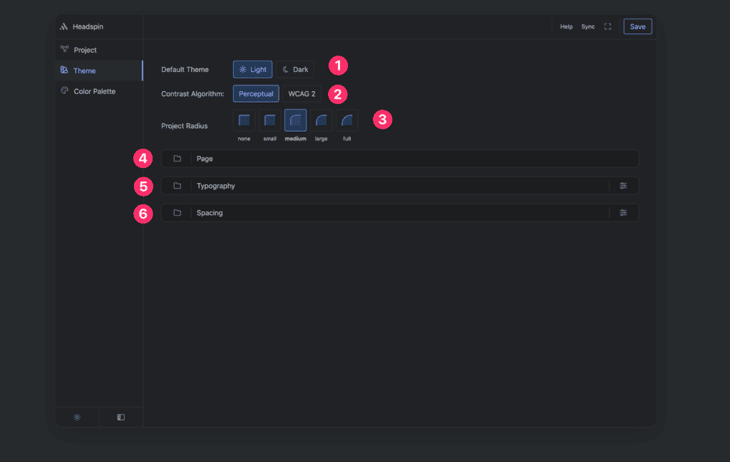
Theme panel consists of:
- Default theme
- Contrast algorithm
- Project radius
- Page setting group
- Typography settings group
- Spacing settings group
Default theme
Options: Light | Dark
Under default theme you could pick up light or dark theme as default theme. Both theme will be generated, here you pick which will be primary theme.
Local theming
If you are using light theme as default, and you want just one section in design to be in dark theme you could add following data attribute to the section element.
- Name: data-hsx
- Value: dark
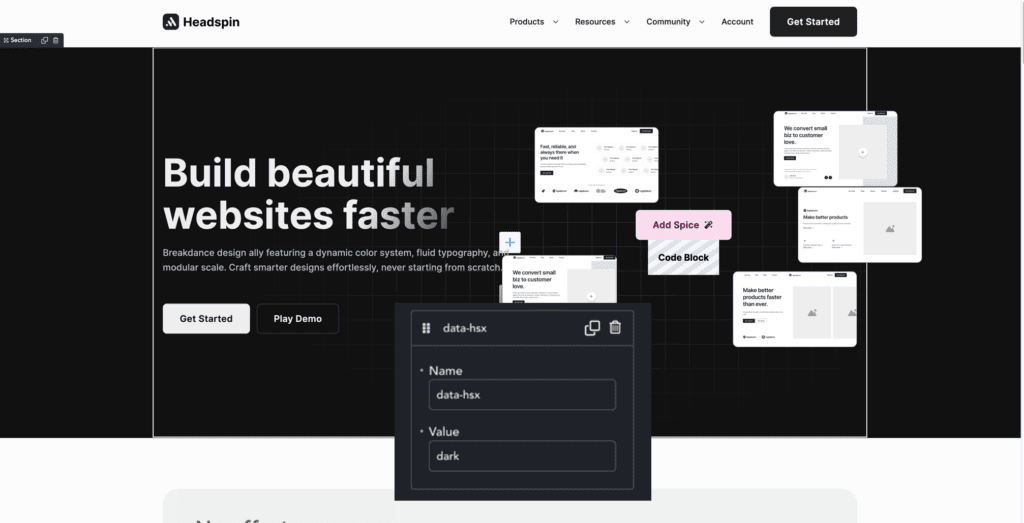
In opposite case if you are using dark theme, and you want to make particular section to appear in light theme variation you could apply following:
- Name: data-hsx
- Value: light
Contrast algorithm
Headspin does check on button color to find right contrast. There are two supported methods of calculating:
- Perceptual
- WCAG
WCAG is related to current standard for calculating contrast levels, and Perceptual is related to upcoming standard which should adress some problems of the current standard.
Project radius
Options: none | small | medium | big | full
These options will affect all of the radius tokens inside project. If you select none you will get sharp design where elements won’t have any radius applied, and if you select full buttons will be pill like design and your site design components will be using biggest radius supported in the system.
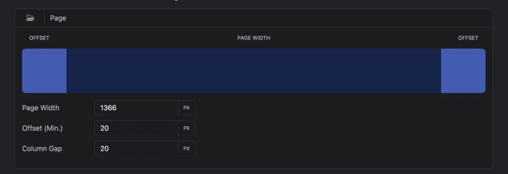
Page settings group
Under this settings group you will get following options:
- Page width
- Offset (min.)
- Column gap
Page width
This will control how wide your page content should be and limit design to this width.
Offset (min.)
This will control minimal distance of content from the edge of screen,
Column gap
Default gap for project.
Typography settings group
Typography settings group consists of three controls:
- Font size preset control
- Line height preset control
- Advanced typography control
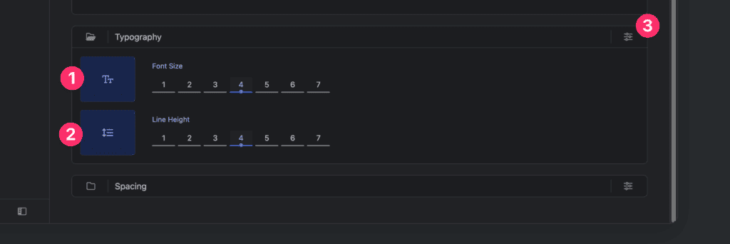
Font size presets
Options: 1-7
With seven buttons to control, you can configure with one-click typography font size. This will adjust every typographic token size in project.
Line height presets
Options: 1-7
With seven buttons to control, you can configure with one-click typography font size. This will adjust every textual element line-height in project.
Advanced typography controls
If you are not fully satisfied with typography inside project and you want to tweak it further. This button will take you to advanced settings where you will have granular control about every part of typography.
Spacing settings group
Spacing settings group consists of three controls:
- Section space preset control
- Component space preset control
- Advanced spacing control
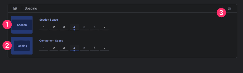
Section space
Spacing scale used for creating vertical negative space inside section.
Component space
Main spacing scale, should be used for almost everything else except big spaces inside and between section. If you need bigger space, go with section space as exception.
Advanced spacing controls
If you want tweak spacing more, you could use advanced spacing control to have more granular control of spacing.