Panel overview
As shown in the image below, here are all project options under Project tab.
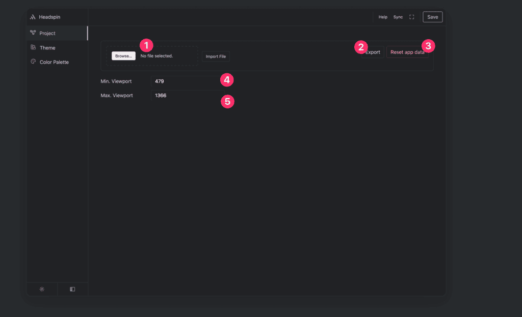
Options in Project panel are following:
- Upload/Import configuration file
- Export current configuration
- Reset app data
- Minimal Viewport
- Maximal Viewport
Import configuration
In order to import you could drop configuration panel in dropzone, or click on Import file in order to pick file from your computer.
All configuration files include .headspin file extension.
Export configuration
In order to use configuration in another project, you could click on Export button. After clicking, you should see something like my_project.headspin in browser downloads and in your download folder.
Rest app data
If you are not happy with your current configuration, and you would like start from scratch you could click on reset app data button and it will clear all your settings so you could make new configuration from scratch.
Minimal Viewport
This controls minimal screen size for fluid setting, below this value fluid tokens will stop scaling. All fluid sizes in between will be proportionally scaled.
Maximal Viewport
This controls maximal screen size for fluid setting, above this value fluid tokens will stop scaling. All fluid sizes in between will be proportionally scaled.
Viewport visualization
Description between minimal and maximal viewport may be confusing for new users, in this part of article we are going to make clear what settings will be affected with this control and how does it affects them.
Settings that are affected with Min./Max. Viewport are following:
- Typography
- Spacing
These settings are using method of generating fluid sizes with CSS clamp() function. And viewport settings are needed to define when fluid sizes should start scaling and when they should stop. Everything below Min. Viewport will take minimal value, everything above will take maximal value as shown in the image below:
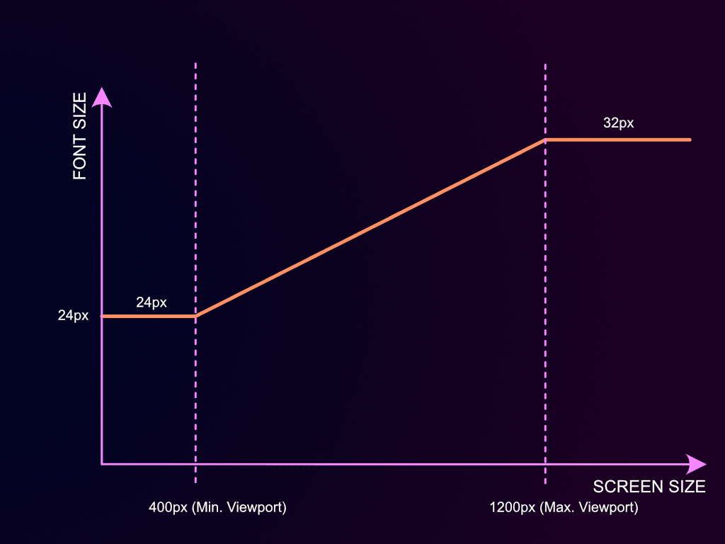
Let’s examine graphical sample above, and we could notice that our viewports settings are:
- Min. Viewport: 400px
- Max. Viewport: 1200px
And our font-settings are:
- Min. Font: 24px
- Max. Font: 32px
That means that below 400px (Min. Viewport) Font-size will be 24px. At 400px it will start growing as screens gets bigger until it reaches 1200px (Max. Viewport) where it will be 32px and after screen size of 1200px it will stop growing and it will always be 32px (max. font size)