Color system inside Headspin Copilot is based on Radix UI colors. These colors are well documented and crafted to support light and dark theme.
Interface overview
Color palette interface consists of 5 main parts:
- System schemas
- Custom schemas
- Focus
- Browse
- Create new color
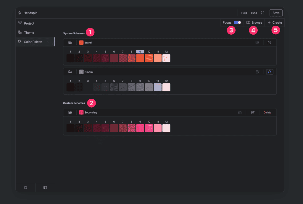
System schemas
These colors you will need to have when using Headspin Copilot. So you will need at least Brand and Neutral color palette.
Brand color palette
This is main site color palette. You cannot delete this palette and you could only edit it to pick main color of your site.
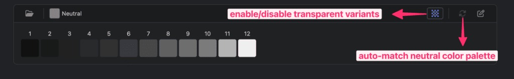
Neutral color palette
This is main color to support brand color. By default neutral will be auto-matched with change of brand color. If you want to pick neutral color without auto-matching you need to enable this and you edit button will appear next to it.
Custom schemas
These are per project optionally created colors. These can be edited, and deleted.
Color palette options
All colors have transparent variants and edit control
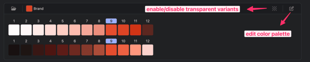
Custom color palette have delete color option in addition to two mentioned above.
Neutral colors will have special auto-matching button if you want Headspin to change neutral color based on brand color.
Focus control
If you want to preview both dark and light palettes, you can turn off focus and you will be able to see both variants.
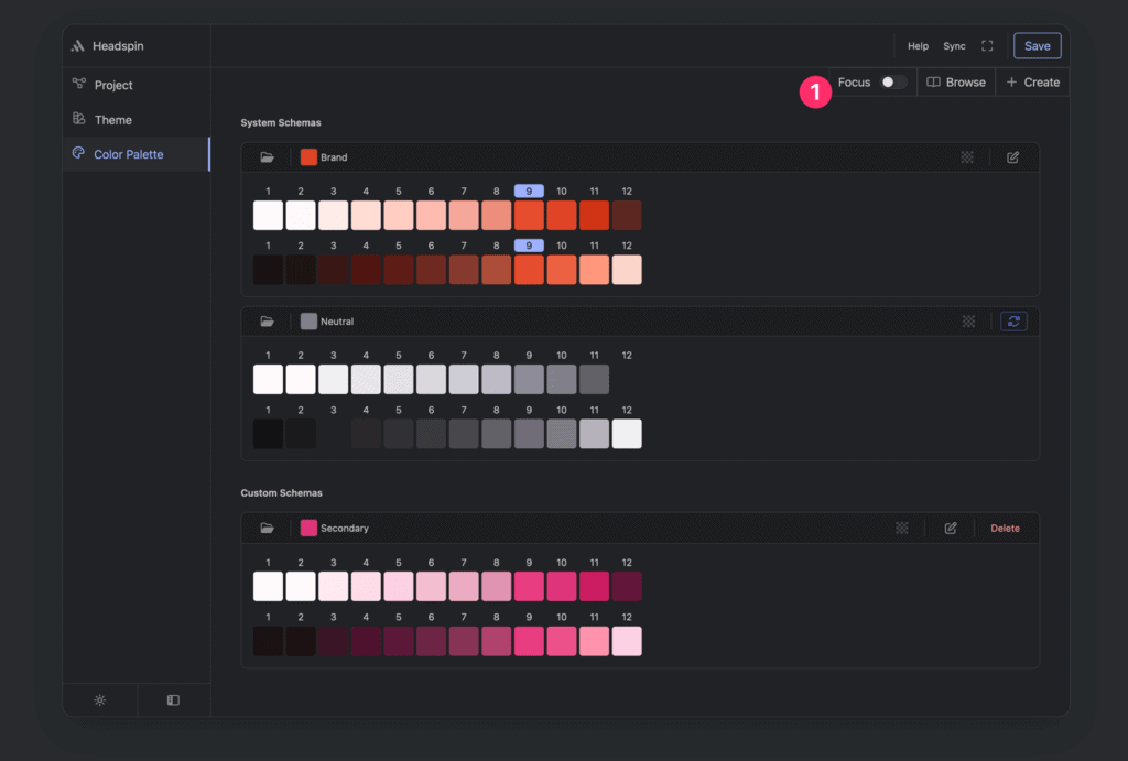
Browse control
By clicking on browse button you will see all Radix colors available in Headspin Copilot application.
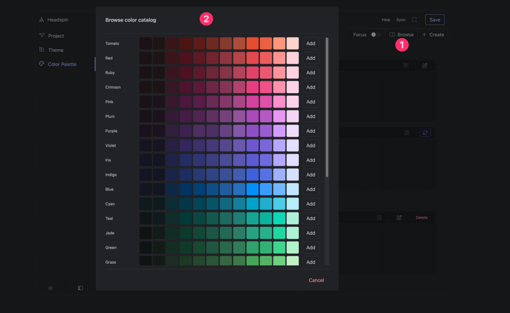
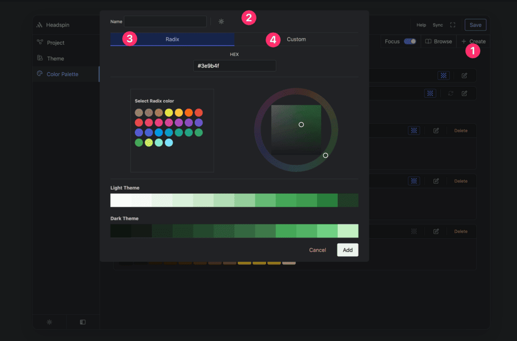
Creating new color
By clicking on create button (1) you should see modal (2) like this.
You will have option to pick Radix color or you can switch to custom to generate color based on your custom base value passed in input field.