2.0.2
Copilot v2.0.2
Copilot v2.0.2
Copilot v2.0.2
Changelog:
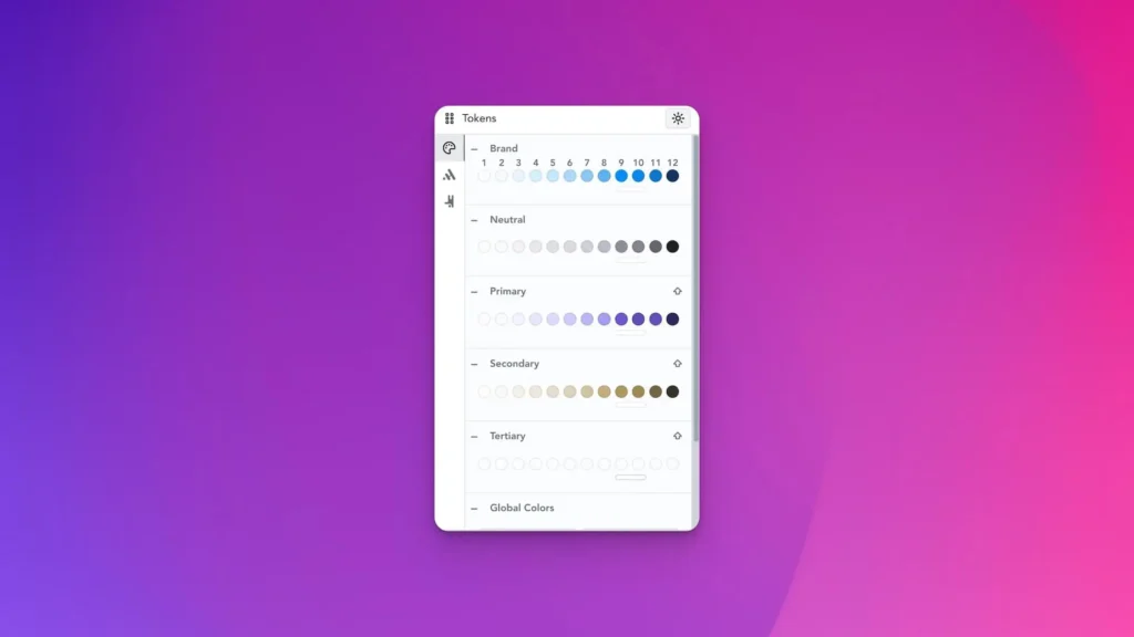
[POLISH] Token editing UX
[POLISH] Unified v2 colorpicker across panels
[FIX] Transparent colors
[FIX] Color changes on palette editing (v1 color picker)

Copilot v2.0.0
Copilot v2.0.0
Copilot v2.0.0
2.0.0-BETA release changes: https://headspinui.com/blog/copilot-v2-0-0-beta1/
Improvements:
- Multisite compatibility
- Color sync fix (importing disabled colors)
- Migrations from 1.X versions
- Improved live style changes preview code
Copilot v2.0.0-beta1
Copilot v2.0.0-beta1
Copilot v2.0.0-beta1
Before everything, we wanted to make everything the same, but improved. All advanced options are hidden by default as we want to keep easy interface by default and enable additional things only if user needs.
Download
Beta 1 could be downloaded here:
Commitments
Behind everything let’s explain what we’re committed to do.
First of all plugin should not break sites by update, and new configuration CSS is updated only when you are present and click Save.
All existing sites should have seamless migration to new things when they hit save, so for each new thing we need to write down migration logic to map out old and new system.
Not forcing – at v1.0.0 we did not have tokens panel, so some Breakdance connection (connection = override and takeover control in CSS) were hard-coded. Since addition of Tokens, we have fully migrated all the settings to Tokens and made discrete migrations, and with v2.0.0 all of these should be migrated. That required as to model things few times, and fine-tune Tokens data structure. Now all overrides are exposed in the Tokens>Breakdance and you have full control what you want to have connected, what you want to remove and handle with Breakdance global settings.
Bringing enterprise flows to page builders (pro)
Beta 1 is the first step to rollout options which are mostly reserved for enterprise system like Contrast-first workflow with colors and the best thing is that all the site will have option to do that, you could build like you have done until now and somewhat in future you could just activate these and take advantage.
Next phase till stable will be contrast relational rules which will be enable to have color contrast relations with healing if it fails minimal contrast in easiest flow of its kind.
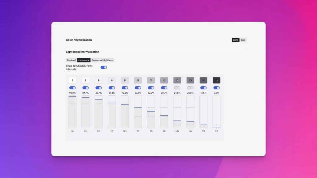
Luminance grading
Bringing luminance based normalization of all the color palettes mean that you will have exactly the same contrast relation across all palettes. To make this easier we have made integration that brings US Web Design System inspired luminance intervals and point system. To pass AA you need 50+ point difference so making contrast we converted from complex math to base math of slide until it is background +50.
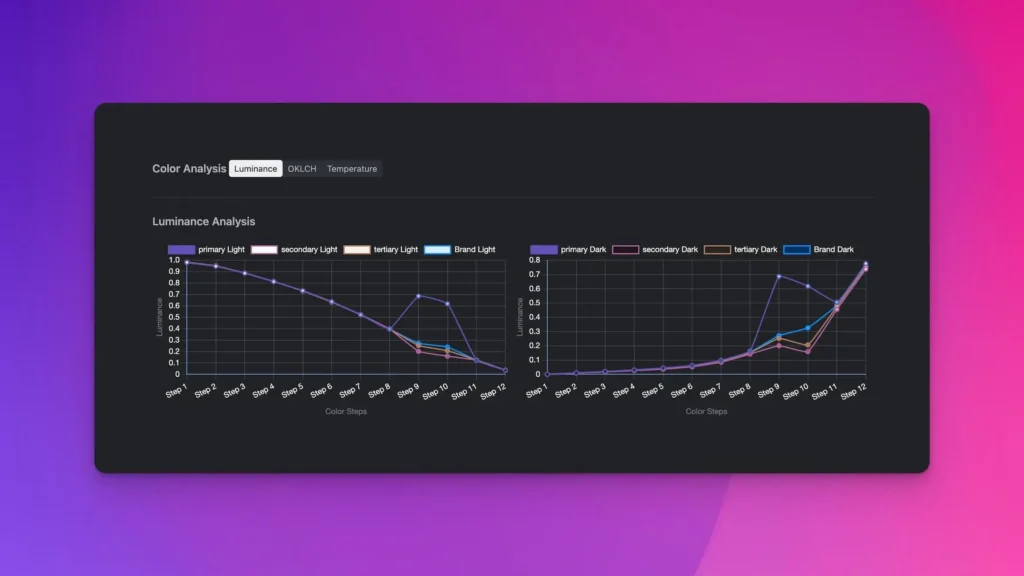
Color analysis
If you want to learn more about colors, we have special tool to see luminance, OKLCH values and temperature.
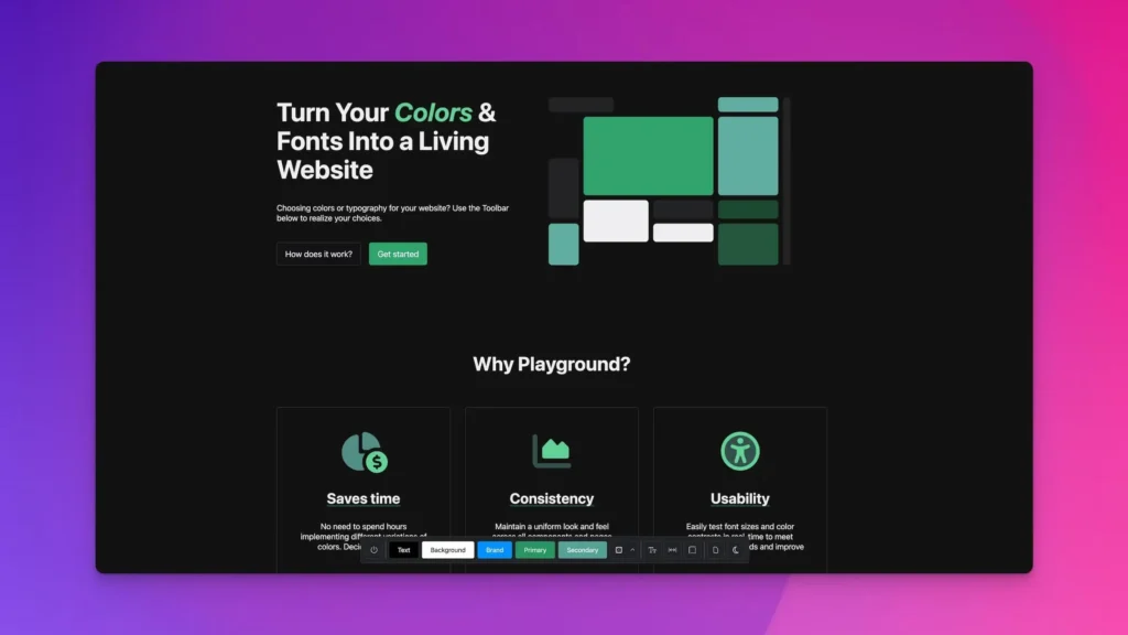
Playground (pro)
Based on user feedback we have made settings preview template to see changes in real time and quickly setup base project configuration. You could play and tune various configuration while template will reflect and preview how these are playing together.
Context menu (right click)
Besides fixing issues, we have implemented every single request that users had related to how this could work.
Improved smart suggestions
We’ve improved our mappings to make even more smart suggestions (smart suggestions = we suggest colors if you right click on colors, spacing if you right click on spacing). Now we should pick almost all fields no matter how they are nested.
Improved color groups
We’ve made label system to suggest you which shades are you using.
Improved nested dropdown
Dropdowns are tricky to track as context menu needs to be inside, if we place outside it would close dropdown and right-click would not work. To combat this we used mounting menu inside dropdown and made algorithmic CSS to target Breakdance dropdown only if menu is mounted. We’ve learned lesson from having problem with color picker, now we only modify if dropdown exists to prevent any issues. If right click is mounted (opened) than we adjust dropdown to make bigger so you could see out right click and we make our menu smaller. All this is made in algorithmic CSS manner to make it less intrusive.

Better overview in Theme panel
We’ve made special color overview group so you could have all colors at glance there. Now you could see and configure colors without need to go to color panel, color panel will be for advanced color stuff.
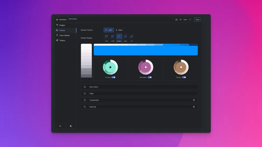
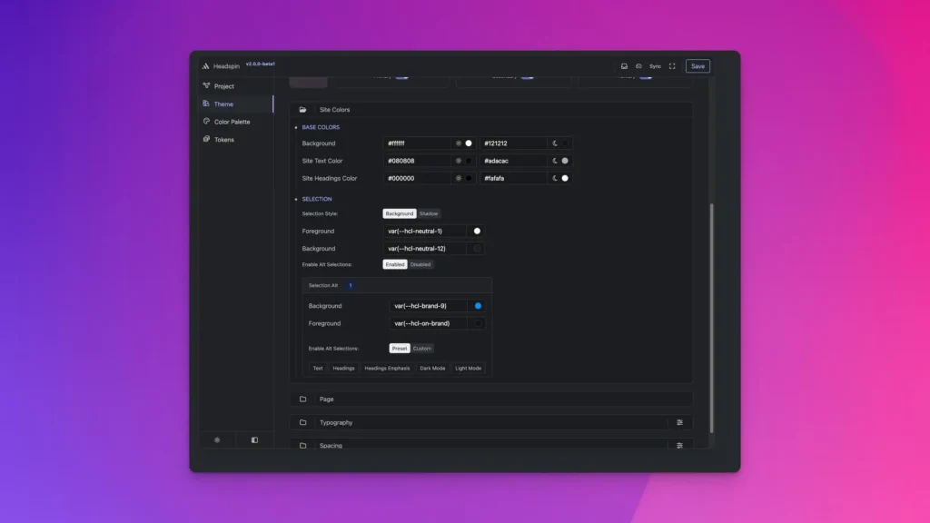
Site color control
Now we have special Site color group to control site colors from Theme panel. Also we have added option to control selection and make alternative selection styles.
Configuration API
Simple API which enables endless integration. We’re opening configuration capabilities to build own UI on top of the Copilot. You could create own UI for clients, or create UI for automated site creation. All crucial controls exposed with simple API, use Copilot under the hood, have live CSS reload so user could see changes while picking options, you could learn more about configuration API here with docs and examples.

Configuration API – reference
Configuration API – reference
Configuration API – reference
What is Configuration API? It is our new API introduced in Copilot v2 which aims to provide advanced automation capabilities.
Use cases:
- Client Wizards
- Automated site generations workflows
How it could work:
- Inject our App as hidden iframe (enable client side CSS building)
- Use our Configuration API (Broadcast Channel API under the hood)
Why Client side CSS build via iframe
CSS is front facing of application and building it server side is limited as server has less clue around computed styles than client side methods. Under the hood we use libraries for color manipulation, contrast checking, and have evaluator which enables programmatic contrast relations and this things could only be done at the front so we could use browser as tool to evaluate computed values.
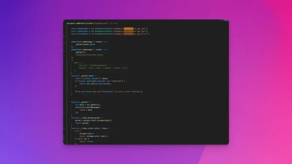
Initializing communication channels
This is like telling to browser to make cross tab channels to send/get data. After defining we could send data using .postMessage or subscribe to listen data on some channel.
/*1. Push user choices from your configuration to our app*/
const setChannel = new BroadcastChannel("headspin_configurator_api_set");

/*2. Get configuration API current data*/
const getChannel = new BroadcastChannel("headspin_configurator_api_get");

/*3. Catch improper commands, use it in dev to have feedback around allowed types*/
const errChannel = new BroadcastChannel("headspin_configurator_api_error");
Set Channel
After defining channels to communicate, we could now tell app to change configuration and save data via setChannel:
Set brand color
setChannel.postMessage({
  action: "brandColor",
  param: "#facc15"
});
/*<param/> any valid color*/
Set neutral color
setChannel.postMessage({
  action: "neutralColor",
  param: "#facc15"
});
/*<param/> any valid color*/
Set project radius preset
setChannel.postMessage({
  action: "projectRadiusPreset",
  param: "medium"
});
/*<param/> none | small | medium | large | full*/
Set project component spacing preset
setChannel.postMessage({
  action: "componentSpacingPreset",
  param: "m"
});
/*<param/>  xxs | xs | s | m | l | xl | xxl*/
Set project section spacing preset
setChannel.postMessage({
  action: "sectionSpacingPreset",
  param: "m"
});
/*<param/>  xxs | xs | s | m | l | xl | xxl*/
Set project font size
setChannel.postMessage({
  action: "fontSizePreset",
  param: "m"
});
/*<param/>  xxs | xs | s | m | l | xl | xxl*/
Set project line-height preset
setChannel.postMessage({
  action: "lineHeightPreset",
  param: "m"
});
/*<param/>  xxs | xs | s | m | l | xl | xxl*/
Set disable/enable line-height presets
setChannel.postMessage({
  action: "disableEnableLineHeight",
  param: "disable"
});
/*<param/>  disable | enable */
Set project mode (light/dark)
setChannel.postMessage({
  action: "themeMode",
  param: "light"
});
/*<param/>  light | dark */
Save configuration and output CSS
setChannel.postMessage({
  action: "saveApp",
  param: "save"
});
/*<param/>  save */
Get configuration current state app data
If we need to sync wizard with theme generator, we could use getChannel for that task. Getting all configuration API current state data is easy as
/*1. === We need to subscribe to listen response*/
getChannel.onmessage = (event) => {
    console.log(event.data)

};
/*2. === Let's grab data*/
getChannel.postMessage({
    action: "get",
});

/*
=== This should log something like ===
{
  "data": {
    "brandColor": "#0090ff",
    "neutralColor": "#8e8c99",
    "projectRadiusPreset": "medium",
    "componentSpacingPreset": "m",
    "sectionSpacingPreset": "m",
    "fontSizePreset": "m",
    "lineHeightPreset": "m",
    "disableLineHeight": true,
    "themeMode": "light"
  }
}
*/
Error Channel
We could subscribe to error channel to listen for incorrect data setting:
/*1. === We need to subscribe to listen response*/

  errChannel.onmessage = (event) => {
      console.log(event.data)
  };

/*2. === We could get feedback if doing something wrong for example setting fontSizePreset to numerical value 100px would tell us that under that action allowed values are xxs-xxl
{
  data: {
    action: "action::fontSizePreset",
    context: "allowed values: xxs | xs | s | m | l | xl | xxl"
  }
}
*/
Headspin Copilot v1.4.0
Headspin Copilot v1.4.0
Headspin Copilot v1.4.0
We’re excited to introduce completely re-invented concept of the Context Menu or better to say Context Menu v2. Initial version served us and our users really well, but with recent new features in the Copilot, initial version was limited and could not support all things were present in Copilot like custom tokens.
Features overview
- Organize in Collections, Groups and Tokens
- Support for colors (solid and transparent)
- Light/dark mode switcher
- Support for Custom CSS
- Context aware color representation
- Real-time updates
- Smart suggestions
Following Collection, Group, Token standard as organizational units.
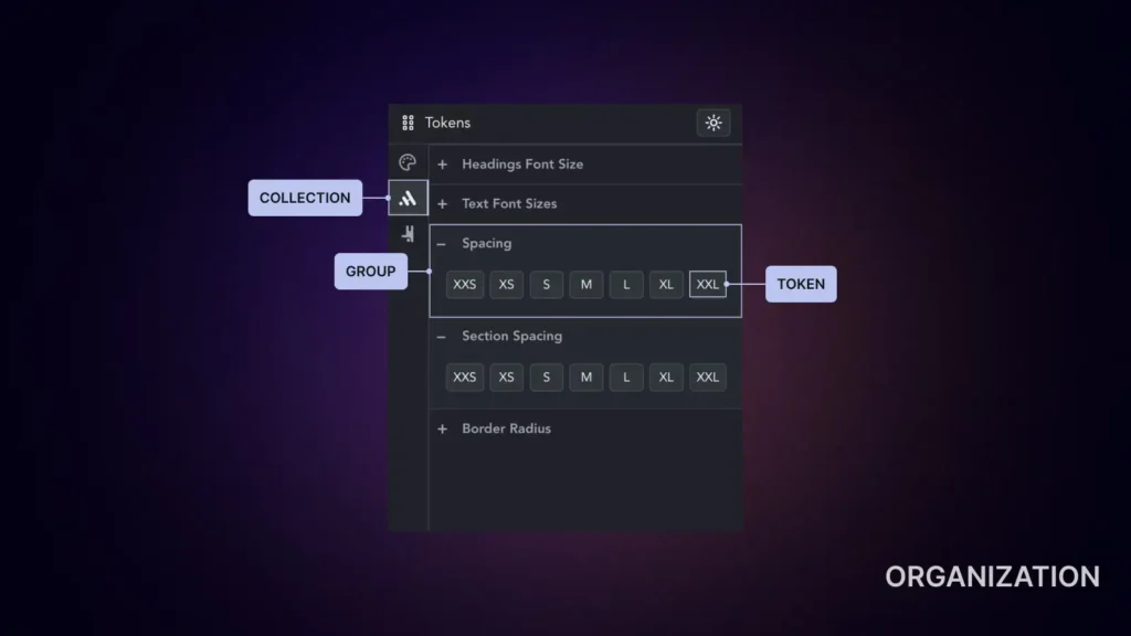
Just like in the main application, we have incorporated the same organizational units here, called Collections (icons on the left). Groups are represented in an accordion fashion, and tokens are presented in button form.
Smart suggestions
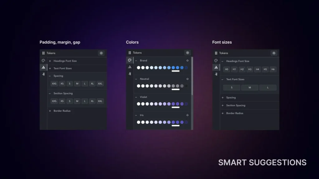
In order to provide the best experience, we have implemented suggestion filtering. So instead showing everything we’ll try to find exactly values which you may want to use for example if you do right click on color input, we’re going to suggest colors, if you want to edit gap, margin, padding we’ll suggest spacing variables. So while we have added bunch more data in one-click fashion via context menu, it will be even more intuitive to use than previous v1 because it won’t just show everything.
Full support for colors
Every color that is handled via Headspin will be available via context menu. This includes color palettes, but also color tokens.
Supporting custom CSS
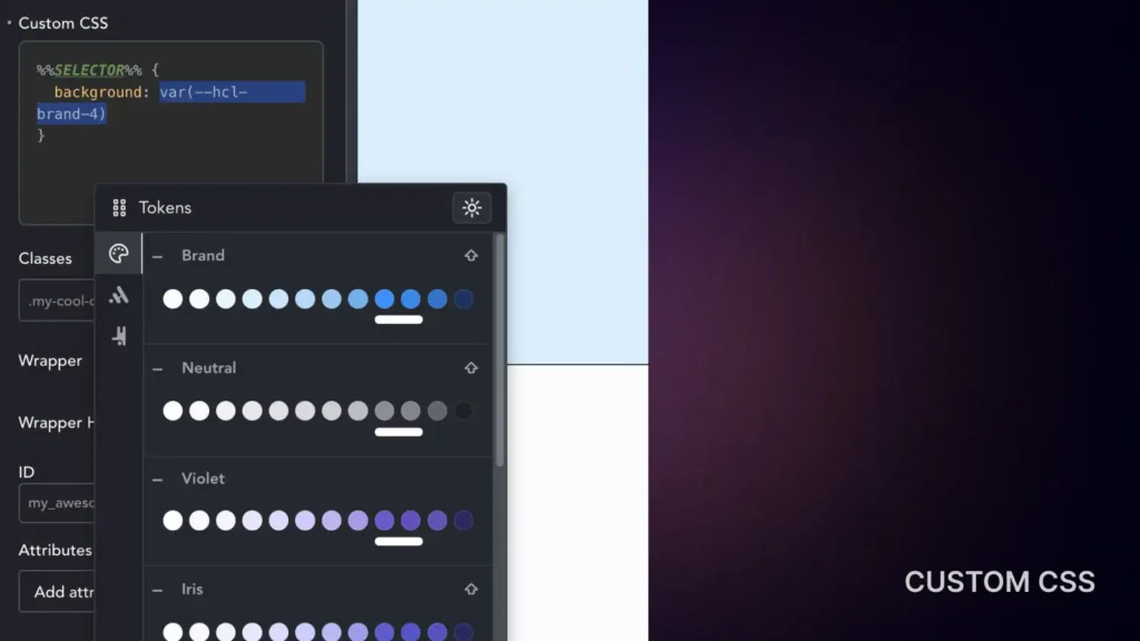
Many users, including ourselves, like to use custom CSS from time to time. Writing out all of our variables can sometimes be frustrating, as you also need to remember naming conventions and other details like that. With the new version of the context menu, you will have the option to simply right-click and change any text there as well.
Support for transparent variants
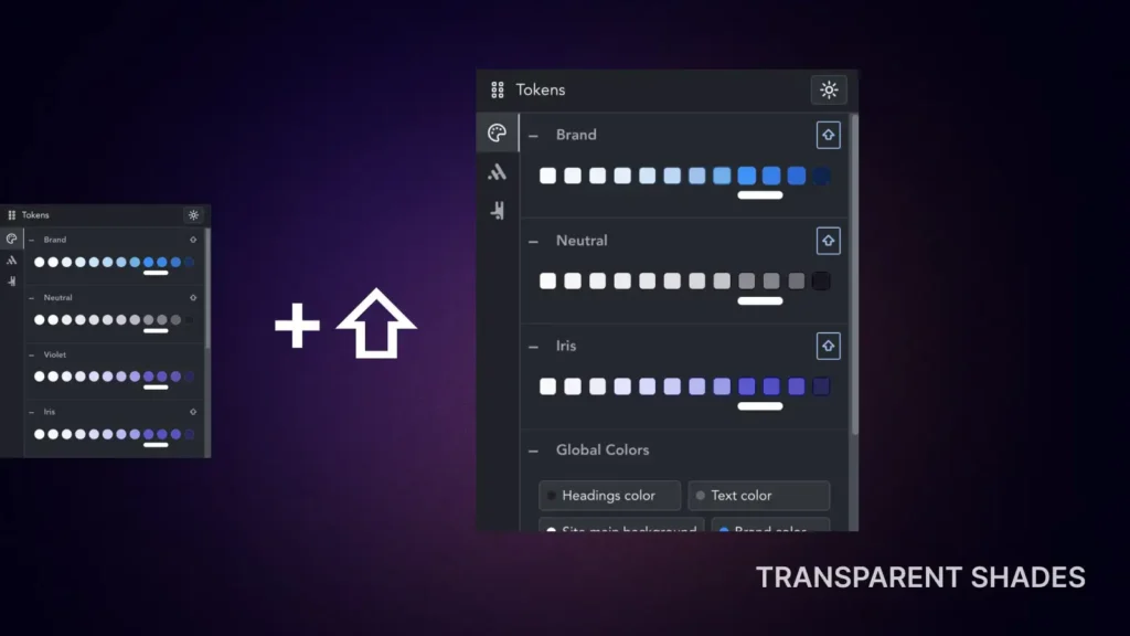
Color palettes that support transparent variants will have shift key symbol indicating that by pressing shift it will show transparent shades.
Furthermore, we have taken an additional step by incorporating a context-aware transparent shading technique. The challenge with transparent colors is that they rely on the background and how they blend with it. To address this issue, we have integrated a dynamic site background calculation technique to blend them accurately, providing you with the best possible preview when selecting your shades.
Real-time updates
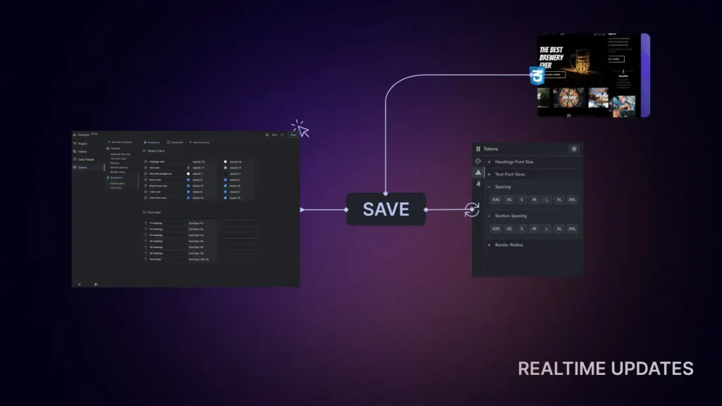
As you work in the Copilot app all changes will be reflected to every opened fronted tab and editor tab. So any changes done in main application will be instantly reflected:
- Frontend
- Page Builder
- Context Menu data
The devil is in the detail
While all of these alone take effort to make, we strongly believe in pushing boundaries how tools could be made. For example CSS variables are dynamic by nature and their value could be redefined (examples of this are dark/light mode, theming, local scoping). We’ve implemented mechanism to find their value at the moment when you apply them so they are fully context aware and will give 100% accurate preview of the values.
We took it a step further by incorporating a context-aware transparent shading technique. The issue with transparent colors is that they depend on the background and how they blend with it. We have implemented a dynamic site background calculation technique to blend them accurately, ensuring you have the best possible preview when choosing your shades.
Component Madness 2024
Component Madness 2024
Component Madness 2024
What is Component Madness? Component Madness is once in a year event from HeadspinUI team. It features 7-day in row releasing various solutions in form of the Components.
2024 Lineup
| Day 1 | Age Verification | Variant 1 Variant 2 Variant 3 |
| Day 2 | Skip Link | Variant 1 |
| Day 3 | Hotspot | Variant 1 |
| Day 4 | Grid Switcher | Variant 1 |
| Day 5 | Morphing Tabs | Variant 1 |
| Day 6 | Animated Stacking Cards | Variant 1 |
| Day 7 | Sub-navigation | Variant 1 Variant 2 |
Day #7: Sub-navigation
Take your navigation game to the next level with the Sub-navigation Component! This powerful tool brings animated secondary navigation to your Breakdance Builder projects, highlighting the active section in view for a smooth and engaging user experience.
Variant 1: Magnetic Sub-navigation
Variant 2: Island Sub-navigation
Day #6: Animated Stacking Cards
Discover the power of the Animated Stacking Cards component in Breakdance Builder! Create visually stunning card layouts with smooth stacking and scaling animations that bring your designs to life. Perfect for showcasing portfolios, testimonials, and feature proposition.
Day #5: Morphing Tabs
Explore the innovative Morphing Tabs component in Breakdance Builder! This feature-rich component transforms traditional tabs into dynamic, interactive elements with smooth morphing animations. Perfect for showcasing content in a sleek and organized manner, Morphing Tabs enhance user experience and visual appeal.
Day #4: Grid Switcher
Discover the powerful Grid Switcher component in Breakdance Builder! This dynamic button group allows users to effortlessly toggle between grid view and list view, making it perfect for showcasing products, portfolios, blog posts, or any content that benefits from multiple layout options.
In this video, we’ll guide you through setting up and customizing the Grid Switcher component to fit your design needs, ensuring seamless functionality and a polished user experience.
Day #3: Hotspot
Add interactive, customizable hotspots to your web designs with the Hotspot component in Breakdance Builder! Perfect for creating engaging product showcases.
Whether you’re highlighting product features, guiding users through a visual journey, or adding a creative touch to your designs, the Hotspot component gives you endless possibilities!
Day #2: Skip Link
Skip links are hidden navigation links that allow users, especially those using keyboards or assistive technologies, to bypass repetitive content (like headers or menus) and jump directly to the main content of a webpage. They improve accessibility and streamline navigation for better user experiences. You could use this component to implement skip to main content, and skip to footer links.
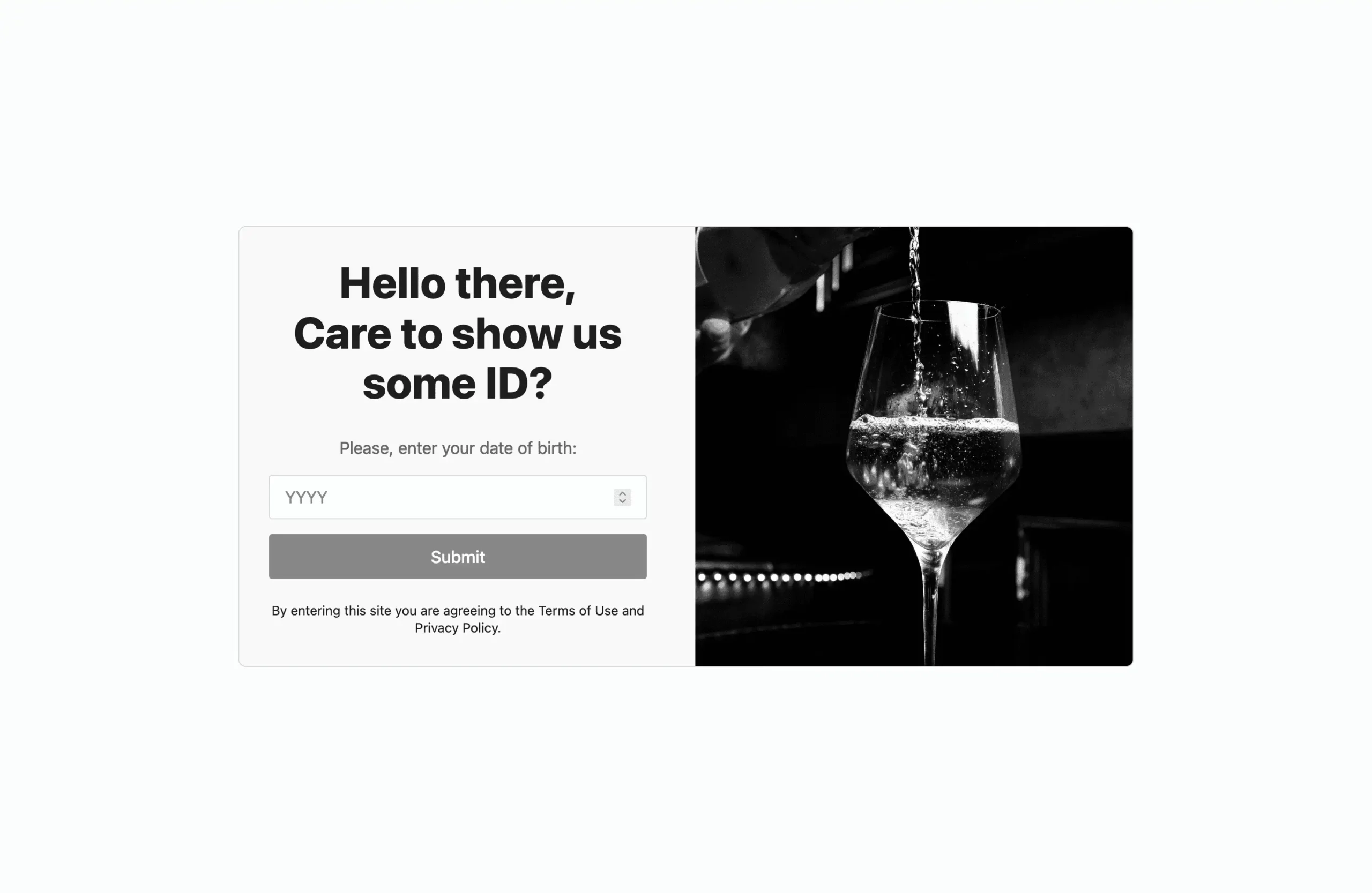
Day #1: Age Verification
Opening Component for this year is Age Verification. Solution seen on many adult, alcohol and tobacco sites which requires user to verify their age before seeing site content. It comes in three variants which are common to see, it uses native Breakdance elements, and Popup template to achieve goals.
Before release we had beta testing with some members, and we have found that cache could make problems with popups and server side cookie check. Because of that we’ve iterated to perform checking logic client side so it could be fully cached.
Variant 1: Year input
Component you could find here, and video below explains setup in Breakdance Builder.
Variant 2: Date inputs
Component you could find here, and video below explains setup in Breakdance Builder.
Variant 3: Yes/No buttons
Component you could find here, and video below explains setup in Breakdance Builder.
Age Verification in Breakdance
Age Verification in Breakdance
Age Verification in Breakdance
We’ve release 3 components which you could user to verify users before showing sensitive content. While it is pretty easy to this in Breakdance and could be done in 20mins, some users may struggle with logic and making small code to check and set cookie.
| Variation | Verfication type | Video | Link to solution |
|---|---|---|---|
| 1 | Year input | Link | LINK TO COMPONENT |
| 2 | Date input (day, month and year inputs) | Link | LINK TO COMPONENT |
| 3 | Button (Yes/No) | Link | LINK TO COMPONENT |
Setup instructions
Breakdance popup template setup
Please navigate: WP Admin > Breakdance > Popups
In top left corner click add new popup.
Click on newly created popup settings. Now we need to set where it applies. In this demo we’ll apply it Everywhere to lock whole site access before visitor verifies age. Mostly this is what you want, but you may want exclude login pages, or apply to certain page. So this may depend on yours particular case.
After doing this, we need to make our popup design.
Breakdance age verification configuration
To recap, we’ve created popup, added Location rule. Now we need to open created popup, and style it. We need to style it to cover whole screen, and disable closing options because only if user verified age popup should close.
Age Verification – Year setup (VIDEO)
Open code block and you will code at the top like this. You only need to edit these values to own needs. Code below these lines is functionality code which you should leave as it is.
// Configuration
const COOKIE_DURATION_IN_DAYS = 30;
const REQUIRED_AGE = 18;
const INVALID_AGE_MESSAGE = "Please enter a valid age.";
const INSUFFICENT_AGE_MESSAGE = `You must be over ${REQUIRED_AGE}`;| Variable | Desc |
|---|---|
| COOKIE_DURATION_IN_DAYS | Sets how long should cookie last in days. |
| REQUIRED_AGE | Sets how old user should be to pass verification in years. |
| INVALID_AGE_MESSAGE | Message which appears when user tries invalid value inside input field which could not be translated to age. |
| INSUFFICENT_AGE_MESSAGE | Message which appears when user is younger than required age settings |
Age Verification – Date setup (VIDEO)
Open code block and you will code at the top like this. You only need to edit these values to own needs. Code below these lines is functionality code which you should leave as it is.
// Configuration
const COOKIE_DURATION_IN_DAYS = 30;
const REQUIRED_AGE = 18;
const INVALID_AGE_MESSAGE = "Please enter a valid age.";
const INSUFFICENT_AGE_MESSAGE = `You must be over ${REQUIRED_AGE}`;| Variable | Desc |
|---|---|
| COOKIE_DURATION_IN_DAYS | Sets how long should cookie last in days. |
| REQUIRED_AGE | Sets how old user should be to pass verification in years. |
| INVALID_AGE_MESSAGE | Message which appears when user tries invalid value inside input field which could not be translated to age. |
| INSUFFICENT_AGE_MESSAGE | Message which appears when user is younger than required age settings |
Age Verification – Yes/No setup (VIDEO)
Open code block and you will code at the top like this. You only need to edit these values to own needs. Code below these lines is functionality code which you should leave as it is.
// Configuration
const COOKIE_DURATION_IN_DAYS = 30;
const REQUIRED_AGE = 18;
const INSUFFICENT_AGE_MESSAGE = `You must be over ${REQUIRED_AGE}`;| Variable | Desc |
|---|---|
| COOKIE_DURATION_IN_DAYS | Sets how long should cookie last in days. |
| REQUIRED_AGE | Sets how old user should be to pass verification in years. |
| INSUFFICENT_AGE_MESSAGE | Message which appears when user is younger than required age settings |
Testing tips
While you are playing with this you should know how to remove cookie. Because you may want multiple times to test, and because your login also relies on cookie so if you remove all of them you will be logged out each time.
Method 1: Please just use browser dev tools it is easy. You could open them with right click + inspect. When they open find Storage tab and click on it. There you will see Cookie section, click on it and find “age_verification_passed_hsx” cookie. Right click on that cookie and it will delete just that cookie.
After doing this reload browser tab to see changes.
Method 2: Another way is to open browser console and drop this small code:
document.cookie = "age_verification_passed_hsx=; expires=Thu, 01 Jan 1970 00:00:00 UTC; path=/;";
window.location.reload();
Client vs Server side protection
These examples demonstrates client side popup implementation. As these are not the some big security measures and easiest way to cheat this is entering just wrong age. Because this alone is not some rocket science protection so keep in mind that technical user could just go to inspector tools and remove this lock. But we think it is easier for 99% visitor to enter wrong age and bypass this than going to developer tools.
Slightly stronger protection would be setting up this as templates, but you may need also hide header and footer templates. Also we advise you to turn off caching fully if you are using server side approach as caching will break template logic because verified user could cache page which will bypass PHP conditions completely.
Do it on your own (server side setup)
If you opt for this below we are giving below setup instructions how you could do it like described below (NOTE: we don’t provide support for this as it will be tons of tickets related to cache problems as user would still want to cache, and page caching should be fully off)
| Template type | Content | Priority | Location | Condition |
|---|---|---|---|---|
| Header | Blank | 2000 | Everywhere | Custom PHP – (1) |
| Template | Component code | 2000 | Everywhere | Custom PHP – (1) |
| Footer | Blank | 2000 | Everywhere | Custom PHP – (1) |
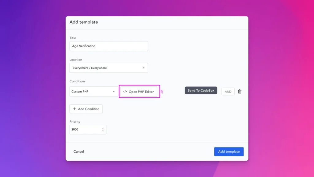
Custom PHP condition code (1)
return !isset($_COOKIE['age_verification_passed_hsx']);Make new custom template, set location to Everywhere. For condition we’re going to check cookie by custom PHP so add that condition and click Open PHP Editor.
In PHP Editor paste code that we’ve provided.
For priority there isn’t some magical number, it should be greater than any other templates so we’ve used 2000. Only important note here it should be higher than any other template. In Template paste just component code which will set cookie.
For Header/Footer we may also want to hide them as they could have some data which should not be shown to user so create just Header, Footer with no content and do the same settings for them. This will just load empty Header/Footer for non-verified users.
Legal disclaimer
This solution let’s you set age and cookie duration. It is pretty simple solution which is seen on many sites. But before implementing keep in mind to obey laws and rules of the countries where sites needs to operate. We provide this solution as it is. If you are not sure is this verification enough, we kindly advise you to check and consult around these compliance things with legal experts.
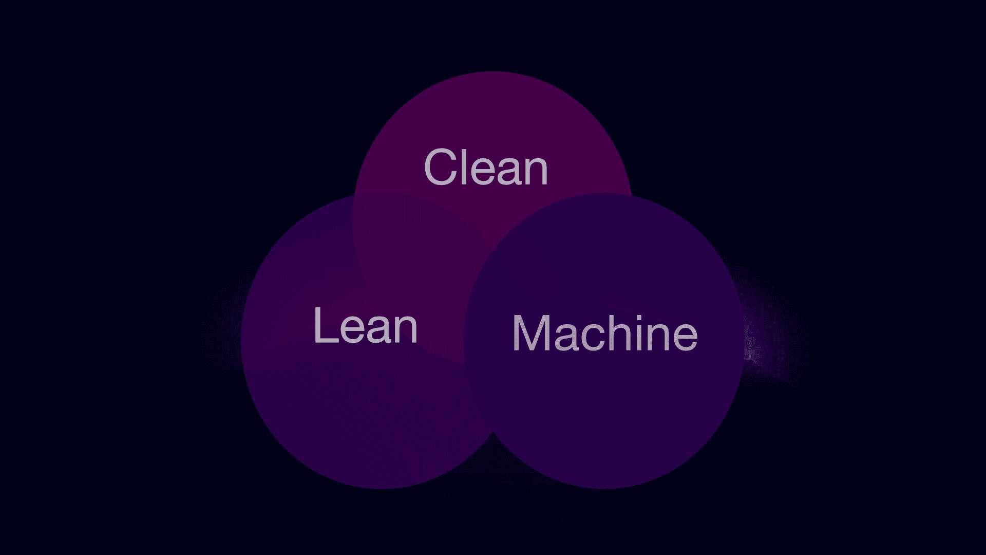
Lean. Clean. Machine.
Lean. Clean. Machine.
Lean. Clean. Machine.
This dropped on my mind when it comes to Copilot plugin. We could use it as slogan. Keep reading to find why.
Lean
Plugin produces lean code. We’ve strategic parts that we don’t give options to disable because some things need to work, if you ever drop some our design, you should not have ability to broke configuration. We’ve spent hours to make this bundle minimal, and if you are not happy we give dedicated panel to extend them, place custom values.
That strategic part is lean investment for the future, because any designer could make some designs based on this configuration and with over 600 our designs and every other made on using this default configuration could use them, everything could be globally controlled and only small strategic fraction of styles ensure this. That is why we call it Lean.
Clean
Code produced by our plugin is equal or better 99% of developers would write on their own. I’m doing personally silly things with CSS variables for years, and trust me it writes better code than I would. Sometimes I wish to spend some time and make plugin architecture that it could write own code.
Machine
We keep your back. As we have all data in the system we are try to find mistakes that you could make. We validate tons of data and give you feedback if we are pretty sure that you have made some mistake. When you are doing some misconfiguration we try to auto-heal and predict all mistakes that could be make. For example you want to override palette which has transparent shades with palette which does not have, this may result in broken interface, we do background check and heal configuration. We couldn’t catch all mistakes, but we’ve tried to predict every user mistake and place some sort of the strategy to help fix mistakes.
We care about doing fallback to improve browser compatibility.
We care that fonts should be defined in REM and respect user zoom settings. While pixel values kill that that we provide interface that let users to work in pixel as we know it is much more intuitive to many, and we do all the boring math behind so you don’t need to do that.
Making complex themes without checking contrast every time? Covered.
We try to care about boring stuff and put that on autopilot (better to say on Copilot) so you could do fun stuff. We’re lazy and we automate boring things.
We theme, like no other
Instead of explaining technical details. We’ll look real world scenario. We are building modern news site, and we want to theme it based categories. Let’s say we have news, sports, magazine, tech, and misc. Also we want to provide users dark and light mode so they could pick depending on the mood or their browser preference.
In order to do we could approach from two sides:
- Creating complex CSS rules
- Creating template for each
If we go with the first route, we’ll spend tons of resources to tweak all of that and keep up with accessibility as we have 10 color combinations to keep track.
Another approach would be to break that to 5 templates and each would support dark and light mode. By breaking this it will be initially easier to do, as it is much easier to think about styling in 2 dimensions than cover all 10 in one go. But this approach is mess in long run as we need to change 5 templates each time, and it works until it falls apart. If someone thinks that this second approach is stupid, we agree, but you would be astonished how many project are made on solutions like this and keep just making it as initially it was easier to develop and logic behind is crap. We all do that, probably this site that you are reading this article has some solutions like that also.
Or, or child could do it?
And final piece of the one more article that is up-selling you miracle. Of course we have made solution that could do it easily that is point. But see we have solution that we could explain this to child and let him create in 10 minutes.
Bonus
Imagine you want to give your client the option to add a page or pages to their site for a special occasion, such as a promotion, to enhance their site. Before taking any action, consider how you would approach this task and estimate how long it would take to complete.
Please watch this video and compare results. Lean. Clean. Machine

Dynamic Lightbox Classic
Dynamic Lightbox Classic
Dynamic Lightbox Classic
Connect Dynamic data


