2.0.2
Theme switches docs
Renato Ćorluka
September 19, 2024
In this article, we are going to cover how we could modify the styling and functionality of theme switches.
Styling options
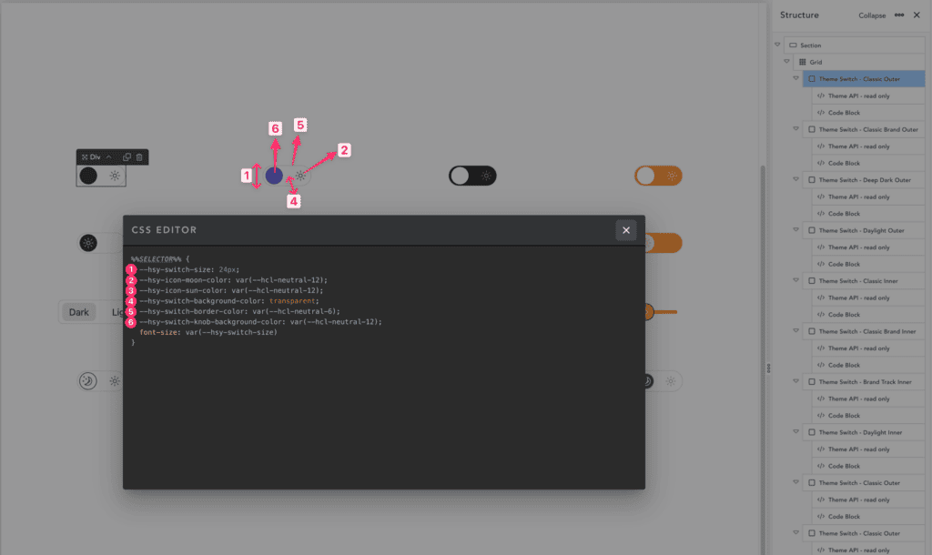
As shown in the image image below, we have 6 options to style:
- Size – controls size of the whole element
- Moon icon color – color of the Moon icon, we use a CSS variable that could be a hex value also
- Sun icon color – color of the Sun icon, we use a CSS variable that could be a hex value also
- Background color – switch background color
- Border color – switch border-color
- Knob color – controls the color the switch knob
Functionality options
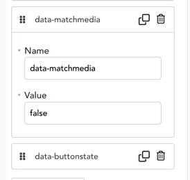
data-matchmedia
Value: true or false
Before the user interacts with the component, we need to display either a dark or light theme. The default theme is taken from the app settings. If we set this to true, the theme setter will check the user’s preferences in the browser and system to determine if they prefer a dark or light theme, and will set the theme accordingly.
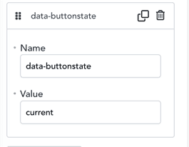
data-buttonstate
Value: current or next
As there isn’t a clear standard regarding toggles, should they display the current state or the next state? With this option, you could reverse the user experience of a component and force it to show an inverted state.