2.0.2
Dynamic Tabs
Renato Ćorluka
September 19, 2024
An a11y-friendly Dynamic Tabs component is designed to be accessible and responsive, providing a seamless user experience across devices. It adapts to different screen sizes by transforming traditional tabs into a dropdown menu or accordion on smaller screens. This component ensures keyboard accessibility, appropriate ARIA roles and attributes, and proper focus management, making navigation easy for all users, including those using assistive technologies.
Getting started
Post loop setup
In the video below, we are demonstrating setup of using dynamic tabs loop component with custom posts, and fields made in ACF.
Repeater setup
Video:
Basic configuration
In order to configure you’ll need locate element called Dynamic Tabs – config and click on Advanced option like shown in the image below:
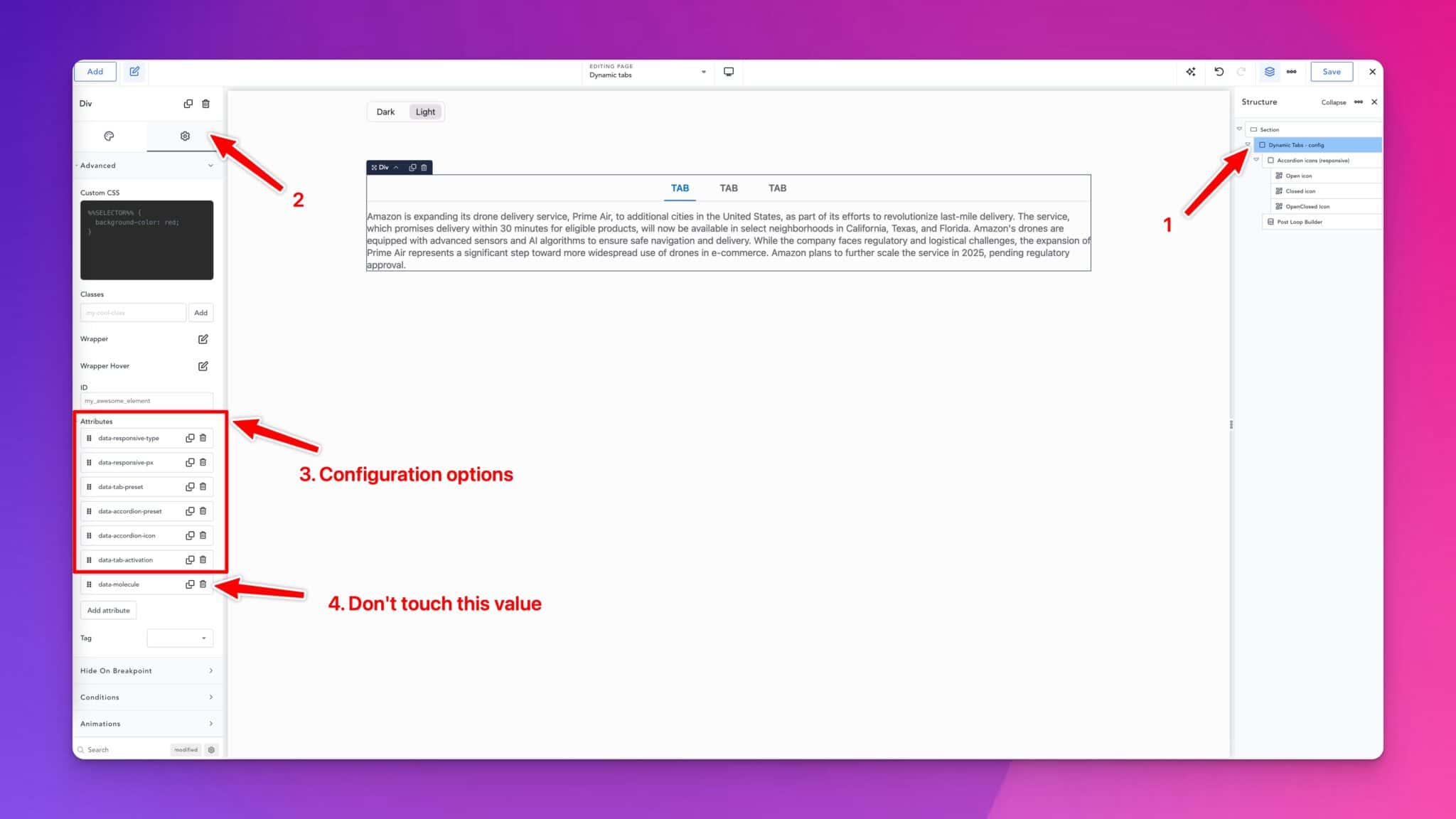
| Attribute | Values | Description |
|---|---|---|
| data-responsive-type | tabs, accordion, dropdown | Should tabs be shown as tabs on the smaller devices? With this you could switch to accordion and dropdown. When to switch is decided by next attribute “data-responsive-px” |
| data-responsive-px | Integer | When to switch to alternative responsive view like accordion or dropdown. |
| data-tab-preset | tabs, pills, bar, dot | Quick tab styling presets |
| data-accordion-preset | classic, pill, bordered | Quick accordion styling presets |
| data-accordion-icon | openclosed, open-and-closed | openclosed – Uses only one icon for both open and closed accordion state. Modify OpenClosed icon if you pick this option. open-and-closed – Uses separate open and closed icons. Modify both Open and Closed icon if you use this option. |
| data-tab-activation | automatic, manual | According to W3C guidelines there are two types of tabs. With automatic automation keyboard arrows will shift immediately tabs, while with manual you will need to confirm choice by Enter or Space key. Recommended value: automatic |
Option configuration
Style presets
Tabs style preset
You should see attribute data-tab-preset under element named Dynamic Tabs – config.
| Attribute name | Value |
|---|---|
| data-tab-preset | tabs |
| pills | |
| bar | |
| dot |
Accordion styles preset
You should see attribute data-accordion-preset under element named Dynamic Tabs – config.
Values:
| Attribute name | Value |
|---|---|
| data-accordion-preset | classic |
| pill | |
| bordered |
Style modification
This is aimed to make direct code modification to our styles. Because this is hybrid component, you could not style it with native elements as HTML markup is made on the fly by using JavaScript so it could support Tabs, Dropdown and Accordion options. In the code you will se comments with enumeration and table below explains what is code responsible for. Use this table as guide to find desired styles that need modification.
Please check style preset section which shows no-code styling option, you may not need custom code or if you pick some preset which matches desired design, or you will need less modification.
| No | Description of applied styles |
|---|---|
| 1.1 | Tabs focus styles. Styles applied when tab navigation item is focused, and styles when content is focused. |
| 1.2 | Tabs navigation wrapper container styles. Div that holds tabs navigation items. |
| 1.3 | Tabs dot preset styles. Conditional styles when dot preset is chosen. |
| 1.4 | Tabs pills preset styles. Conditional styles when pills preset is chosen. |
| 1.5 | Tabs tabs preset styles. Conditional styles when tabs preset is chosen. |
| 1.6 | Tabs bar preset styles. Conditional styles when bar preset is chosen. |
| 2.1 | Accordion icons styles |
| 2.2 | Accordion button to expand styles |
| 2.3 | Accordion classic preset styles. Conditional styles when classic preset is chosen. |
| 2.4 | Accordion pill preset styles. Conditional styles when pill preset is chosen. |
| 2.5 | Accordion bordered preset styles. Conditional styles when bordered preset is chosen. |
| 3.1 | Dropdown (select) base styles |
| 3.2 | Dropdown (select) hover styles |
| 4.1 | Functionality rules, do not modify as it may lead to broken things |
Responsive options
Responsive type
You should see attribute data-responsive-type under element named Dynamic Tabs – config.
Values: Tabs, Accordion, Dropdown
Responsive screen size
You should see attribute data-responsive-px under element named Dynamic Tabs – config.
Values: Integer number (100, 360, 500 etc.)
This will tell when you want to switch from Tabs view to Accordion or Dropdown view.
Advanced styling
Tabs – custom CSS
In order to make advanced design modification of tabs you could you use following selectors:
| Element | CSS target |
|---|---|
| Navigation wrapper | .hs-nav-container.hs-nav-container [role=”tablist”]{} |
| Navigation item (default state) | .hs-nav-container .hs-tablink[aria-selected=”true”] [data-tab=”tabnav”]{} |
| Navigation item (hover state) | .hs-nav-container .hs-tablink:hover, .hs-nav-container .hs-tablink [data-tab=”tabnav”]:focus-within{} |
| Navigation item (active state) | .hs-nav-container .hs-tablink[aria-selected=”true”] [data-tab=”tabnav”]{} |
| Navigation Underline (active & hover state) | .hs-nav-container .hs-tablink [data-tab=”tabnav”]:hover:after, .hs-nav-container .hs-tablink [aria-selected=”true”] [data-tab=”tabnav”]:after{} |
Accordion – custom CSS
Customizing Icons
You should see attribute data-accordion-icon under element named Dynamic Tabs – config.
Values: open-and-closed | openclosed
open-and-closed value will use two separate icons for open and closed accordion state like + and -.
openclosed value will use single icon for example chevron (>) which gets rotated.
In order to customize accordion you could use following selectors:
| Element | CSS target |
|---|---|
| Accordion button trigger (default state) | .hs-accordion-button.hs-accordion-button{} |
| Accordion button trigger (hover & focus state) | .hs-accordion-button.hs-accordion-button:hover,.hs-accordion-button.hs-accordion-button:focus-within{} |
| Accordion button trigger (expanded state) | .hs-accordion-button.hs-accordion-button[aria-expanded=”true”]{} |
Dropdown – custom CSS
In order to customize dropdown you could use following selectors:
| Element | CSS target |
|---|---|
| Select element | .hs-nav-select.hs-nav-select{} |
Custom view styles hooks
In order to target elements under certain view you could use data-hsview attribute as style hook:
| View | CSS target |
|---|---|
| Tabs | [data-hsview=”tabs”] .my-custom-selector{} |
| Accordion | [data-hsview=”accordion”] .my-custom-selector{} |
| Dropdown | [data-hsview=”dropdown”] .my-custom-selector{} |
Accessibility
Tabs
Tab navigation markup
<div role="tablist">
  <button id="tab-1" tabindex="0" role="tab" aria-controls="tabcontent1" aria-selected="true"></button>
  <button id="tab-1" tabindex="-1" role="tab" aria-controls="tabcontent2" aria-selected="false"></button>
  <button id="tab-1" tabindex="-1" role="tab" aria-controls="tabcontent3" aria-selected="false"></button>
</div>
<div id="tabcontent1" role="tabpanel"  aria-labelledby="tab-1" class="is-active"></div>
<div id="tabcontent2" role="tabpanel"  aria-labelledby="tab-2"></div>
<div id="tabcontent3" role="tabpanel"  aria-labelledby="tab-3"></div>
Role, Property, State, and Tabindex Attributes
| Role | Attribute | Element | Usage |
|---|---|---|---|
| tablist | div | The tablist role identifies the element that serves as the container for a set of tabs. The tab content are referred to as tabpanel elements. | |
| tab | button | The ARIA tab role indicates an interactive element inside a tablist that, when activated, displays its associated tabpanel. | |
| aria-selected=”true” | button | Selected button will tell screen reader it is selected by using aria-selected=”true” | |
| tabindex=”-1″ | button | Buttons that are not selected will have negative tabindex to exclude them from tabbing because tab should lead to first focus-able element inside tabpanel. And switching tabs will be done with JavaScript which will listen for ArrowLeft and ArrowRight. | |
| aria-controls=”TCID” | button | The global aria-controls property identifies the element (or elements) whose contents or presence are controlled by the element on which this attribute is set. | |
| id=”NID” | button | ||
| tabpanel | div | The tabpanel role indicates the element is a container for the resources associated with a tab role, where each tab is contained in a tablist. | |
| aria-labelledby=”NID” | div | The aria-labelledby attribute identifies the element (or elements) that labels the element it is applied to. | |
| id=”TCID” |
Keyboard navigation
We are busting navigation with TAB key so user would not go through tab navigation, and would lead him to tab content. Switching tabs is done with keyboard arrow keys. There are two modes of activation:
- automatic
- manual
In automatic activation mode, after pressing arrow keys it will change tabs instantly without need to confirm choice to switch by pressing enter/tab key.
Tabbing through content
When user moves around content, and gets to last focus-able element in tab content, next TAB key press should lead to opening next tab, and vice versa with SHIFT + TAB.
Accordion
Code below is showing simplified markup of Accordion responsive view.
<div class="accordion-content">
  <h3>
    <button id="accordion-button-1" aria-expanded="true" aria-controls="tabcontent1">Tab1</button>
  </h3>
  <div id="tabcontent2" aria-labelledby="accordion-button-1" role="region" class="tab-content" hidden></div>
</div>
<div class="accordion-content">
  <h3>
    <button id="accordion-button-2" aria-controls="tabcontent2">Tab1</button>
  </h3>
  <div id="tabcontent2" aria-labelledby="accordion-button-2" role="region" class="tab-content" hidden></div>
</div>
Keyboard navigation
| Key | Function |
|---|---|
| Space or Enter | When focus is on the accordion header of a collapsed section, expands the section. |
| Tab | Moves focus to the next focusable element. All focusable elements in the accordion are included in the page Tab sequence. |
| Shift + Tab | Moves focus to the previous focusable element. All focusable elements in the accordion are included in the page Tab sequence. |
Role, Property, State, and Tabindex Attributes
| Role | Attribute | Element | Usage |
|---|---|---|---|
h3* | *Heading level is automatically picked up by script which check surrounding content, fallback to script is h3. Element that serves as an accordion header. Each accordion header element contains a button that controls the visibility of its content panel. The example uses heading level 3 so it fits correctly within the outline of the page; the example is contained in a section titled with a level 2 heading. | ||
aria-expanded="true" | button | Set to true when the Accordion panel is expanded, otherwise set to false. | |
aria-controls="ID" | div | Points to the ID of the panel which the header controls. | |
| region | div | Creates a landmark region that contains the currently expanded accordion panel. | |
aria-labelledby="IDREF" | div | Defines the accessible name for the region element.References the accordion header button that expands and collapses the region. region elements are required to have an accessible name to be identified as a landmark. |
Dropdown
Dropdown uses same structure as Tabs, just navigation is replaced with dropdown. Semantics are enhanced with aria-label to tell screen readers that dropdown is related to Content Tabs.
Keyboard Naviagation
| Key | Function |
|---|---|
| Space | When focus is on the unopened dropdown (HTML select element) Space key will open dropdown. |
| Enter | When dropdown is open, Enter key will select dropdown option item and close dropdown. |
| ArrowUp and ArrowDown | When dropdown is open, ArrowUp and ArrowDown key will move selection to next/previous option item. |
| Tab | Moves focus to the next focusable element. |
| Shift + Tab | Moves focus to the previous focusable element. |