2.0.2
Animated theme toggles
Renato Ćorluka
July 24, 2024
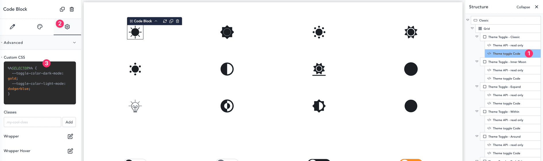
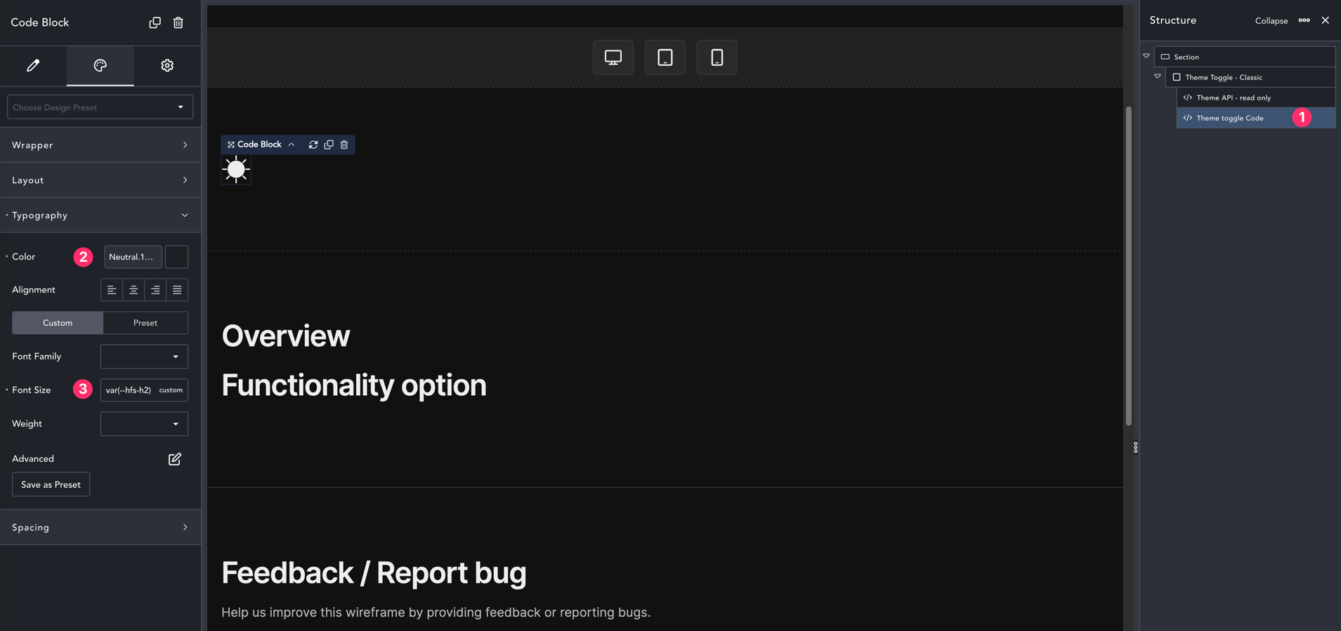
Styling options
For basic styles like size and color we need to navigate to the code block called “Theme toggle Code” (1) and under the design tab we should have the option to set the color for toggle (2).
To make toggle size we need to adjust the font-size (3)
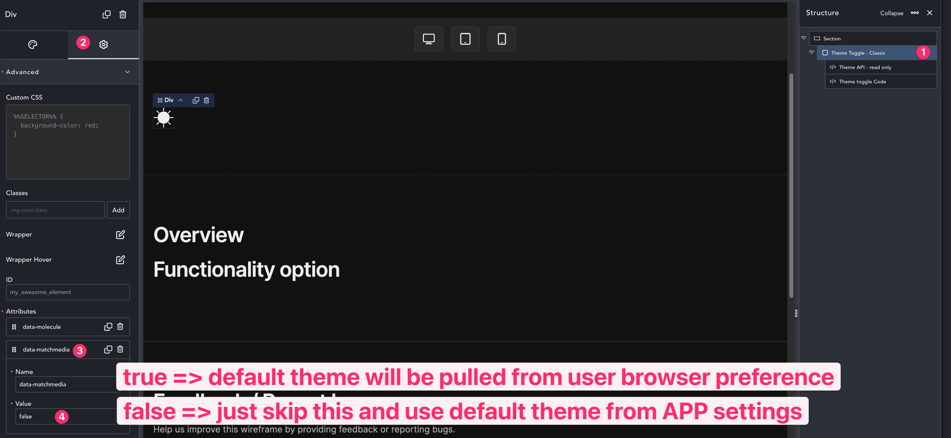
Functionality options
Match media
If we want to use settings from browser preference until the first user interaction as the default theme we should set data-match media to true
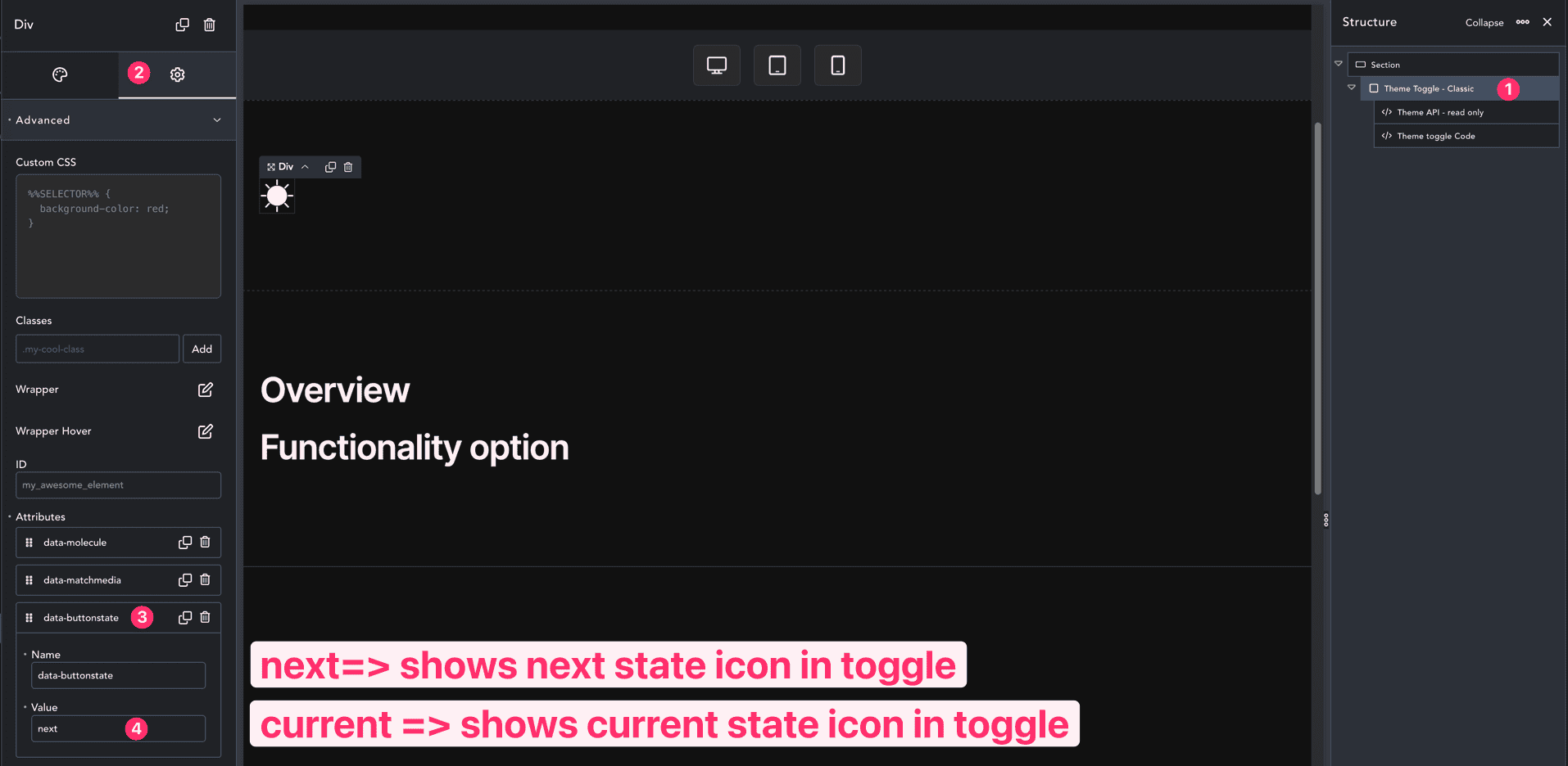
Desired UX
There is an option to data-buttonstate which could be current or next. The default UX is to show the current state (for example, the sun icon in dark mode which represents after clicking it will get to light mode). If the desired option is that the icon shows the next state you need to set this value to next.
Styling per dark/light mode
To set separate colors per dark/light mode you could do the following Theme Toggle code > Advanced > Custom CSS, and drop the following custom CSS. instead of named colors in this example, you could use your own custom hex colors.
{
--toggle-color-dark-mode: gold;
--toggle-color-light-mode: dodgerblue;
}